Background
CM.com's web app to send bulk mobile messages on any messaging platform was updated to allow for rich media messages. The Campaigns application is the most used application within the m SaaS portfolio with 1.000+ users daily all over the world.


CM.com’s most successful application was to include new, rich media channels. The UI needed updating to facilitate the creation of rich messages, which created the opportunity for a redesign to improve adherence to the Aurora design system and to speed up engineering effort for additional future channels.
Process
-
- 🔍
- User Research
- User research into information hierarchy & flow
-
- 🧰
- Technical Discovery
- Collaborate with tech leads to create one coherent architecture fitting for all types of (future) channels
-
- 🎨
- Design
- Iteratively design the new application, adhering to DLS, applying insights, and creating a fully interactive prototype.
-
- 🥼
- Evaluate
- Evaluate the resulting new user flows with users.
🔍 User Research
Recorded user journeys were analysed using Fullstory, creating a baseline for Success Rate, Conversion, Time On Task and Frustration (a combination of rage clicks, dead-ends, and returns).
8 Users were interviewed and observed on how they use the application to send out their marketing messages. Here are some highlights.
🙀
Insight 1: Users just have to pray it is 100% correct
People often experience anxiety when sending messages with the application, especially when sending to 1000+ recipients and with thus with high costs. We call this sender anxiety. They’d better get it right! The application doesn’t much to relieve this anxiety, instead it sometimes adds to it unnecessarily (for example by constantly asking confirmation). The application should put users at ease that everything is correct and ready.

Insight 2: It’s straightforward, but users don’t want to go straight
The application forces users a linear process to send their messages. A major insight was that many users have a need to navigate back and forth between the steps in the creation process, something the interface did not allow for, but was achievable with a workaround. This is highly likely a symptom of sender anxiety. The navigation of the application needs updating.

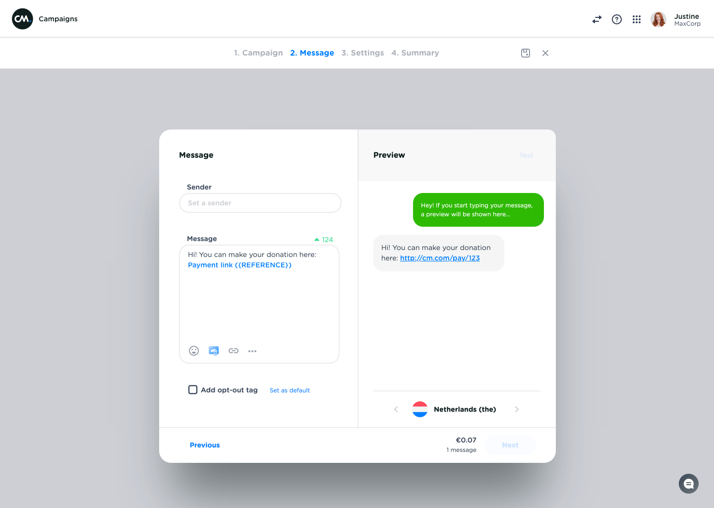
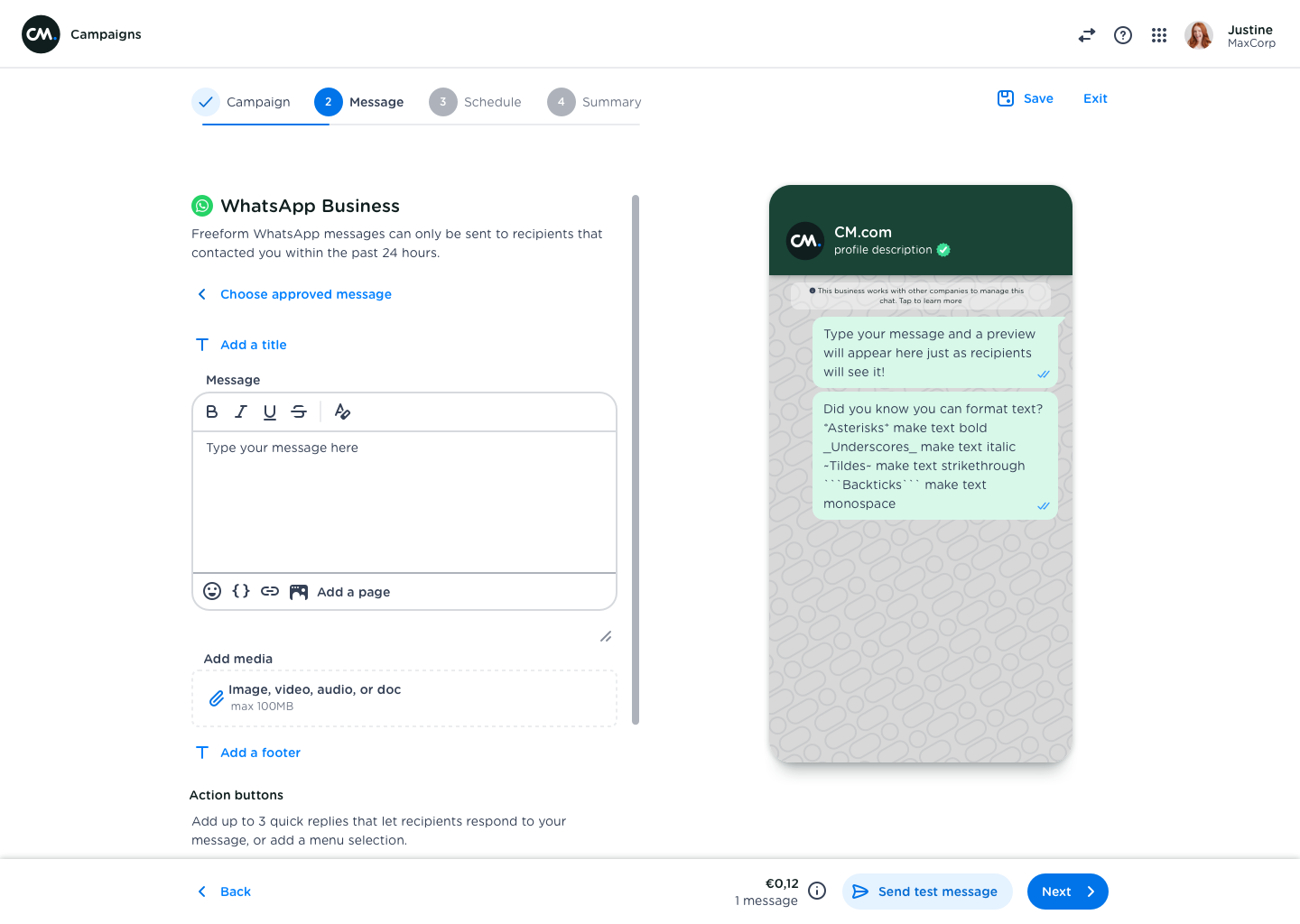
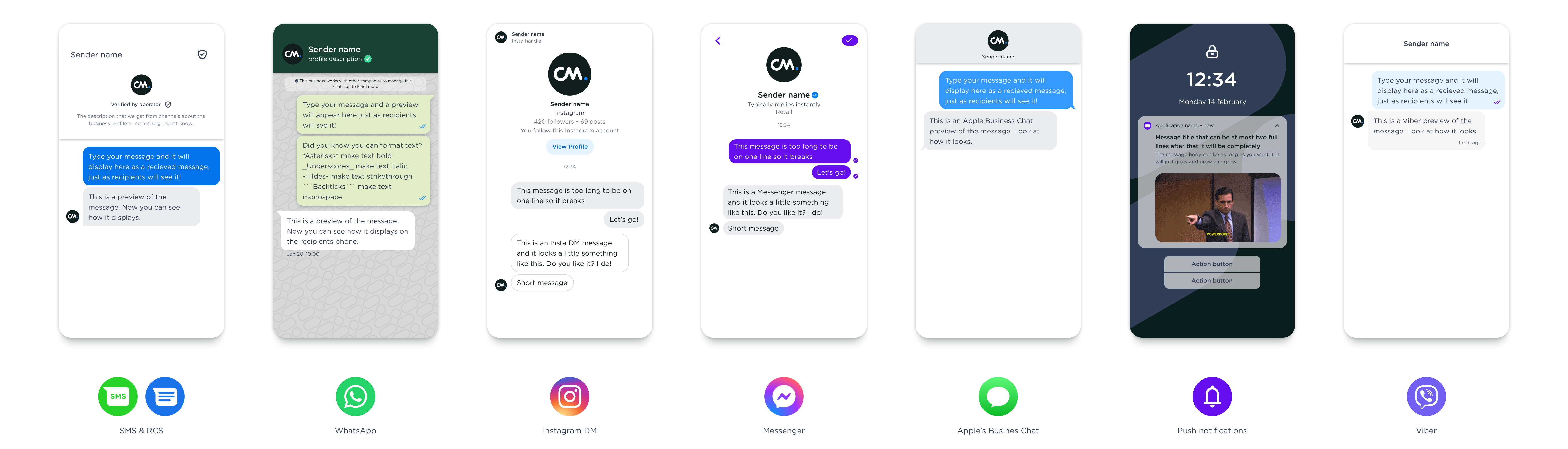
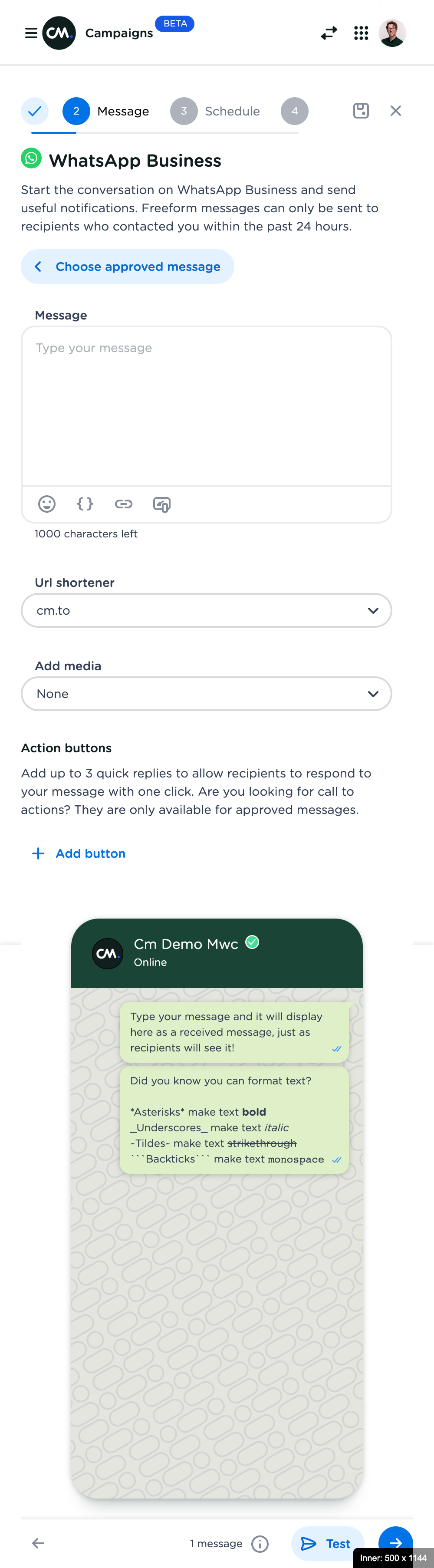
Insight 3: Users don’t know what a message will look like
The preview functionality in the application is lacking. A WhatsApp message in the app doesn’t resemble the real message at all, while this is extremely important for marketeers (for example to know what’s above the fold). The current work around is to send a preview to their own phone, adjust and preview again. This adds to the sender anxiety.
🧰 Technical discovery
The project would have major impact on engineering. The editors and previews for each channel were coded manually, meaning that the simplest changes cost a lot of effort to fix it across all available channels.
We constructed a universal data model for all supported channels, based on CM.com’s messaging API. This allowed for a single form to be used for any channel, promising a consistent user experience.
Front-end has little adoption of the Aurora Design System. This makes maintenance time-consuming and results in inconsistencies between steps and screens.
🎨 Design
The original design was made using Sketch. But later during the project, we (the design team) decided to make the switch to Figma. This allowed me to create an interactive prototype that was easier to test with stakeholders and end-users.
Addition to design system: phone preview
Scroll down to find highlights of the design!
🥼 Evaluation
The interactive prototype was tested with engineers, customer success managers, customer support agents, and 5 users.
Impact
29.3%
Increased conversion rate
48.9%
Decreased conversion time for top ups
76.9%
Decreased error rate
29.5%
Decreased frustration rate
Some highlights
Alleviating send anxiety through a realistic preview
One of the more salient insights involves so called ‘send anxiety’. Sending a message to more than 1.000 people can be intimidating, and the message should be 100% correct.
The new message editor screen helps alleviate send anxiety in multiple ways. At first, the highly dynamic is true to the channel chosen for the message. This way, the user can see exactly what their recipients will see when they receive the message.
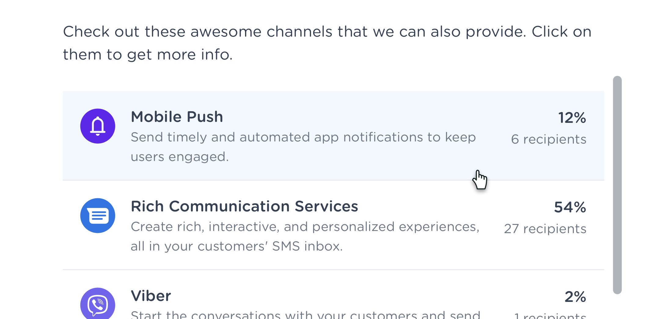
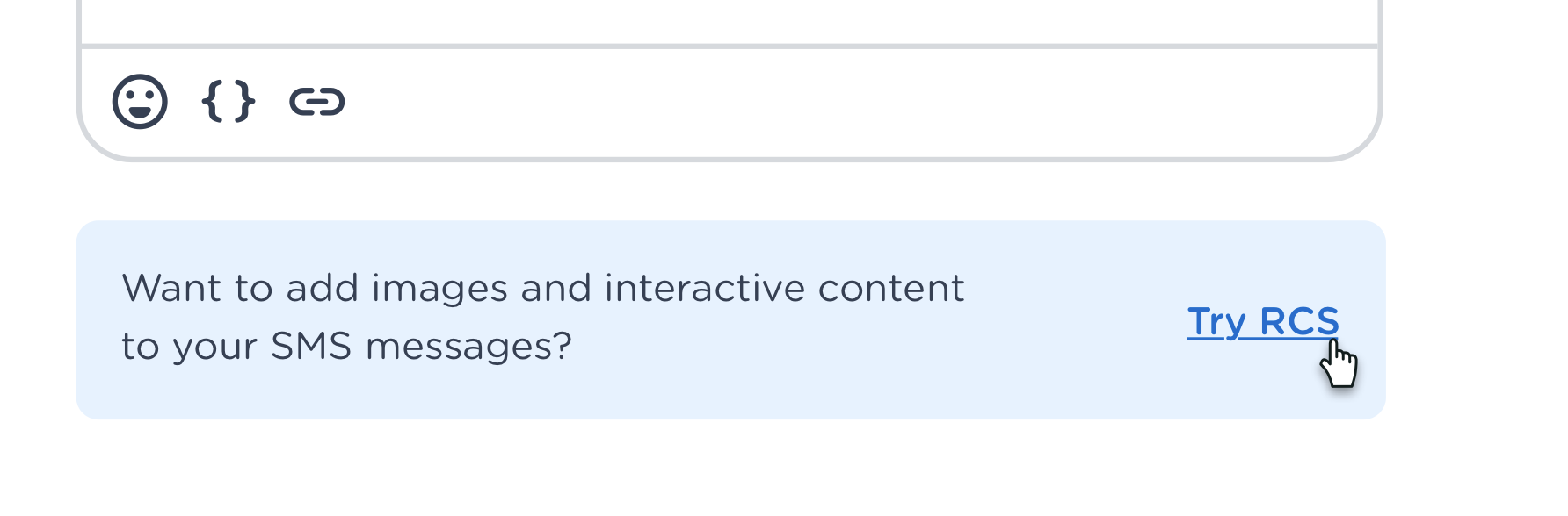
Cross- & Upsell
The original application was build as a development tool, without a SaaS mindset or goals. It therefor didn’t use the available touch points for potential up- or cross-sell.
Research revealed several potential up- and cross sell opportunities across the application, for example to easily top up credits if funds are low, or when rich media could be beneficial to create an easy way for users to try out a new channel.
Responsiveness
Research showed that about 5% of the first-time visits is on a mobile device, but quickly switch to a desktop device, resulting in 1% of all people being on a mobile device. The user experience could be improved by proper responsiveness of the application.
Celebrate successes
The original campaign creator had no success state after successfully scheduling or sending out a message. Instead, users were lead to the overview of all campaigns created.
The moment of successfully completing a task is a great opportunity for some positivity. A new end-state is added, which includes an escape for the user to undo their action (if they suddenly spot a mistake) and next actions are offered.
The right illustration was randomised, selected from one of the 7 below. The app icon is dynamic, changing the the appropriate app chosen for the campaign.

Unified Statistics
Campaign statistics where upgrade to resemble dashboards and statistics in other applications within the product suite.
