The analytics of CM.com’s Customer Data Platform were outdated and considered lacking after competitor analysis. I was leading the UX for the project from need-finding to evaluation.
What is a Customer Data Platform?
A Customer Data Platform (CDP) is software that gathers and unifies customer data from various sources into a single, cohesive profile. Unlike other data systems, CDPs focus on first-party data and provide a real-time, 360-degree view of each customer by consolidating information from websites, apps, CRM systems, and more. This helps marketers create personalised, targeted campaigns and improve customer segmentation. CDPs enable a deeper understanding of customer behaviours and preferences, allowing businesses to enhance customer experiences and drive engagement across channels, ultimately leading to increased customer loyalty and business growth.
More info: https://www.cm.com/customer-data-platform/
Opportunity
The goal was to make the Customer Data Platform product more competitive. The lack of useful analytics was the one of the major gaps that was identified. In parallel, the backend technology for analytics was rebuild to remove constraints in data visualisation. As UX designer I pushed for a user-centric approach to the second iteration to ensure a good fit with the user needs.
Result
A fully revised approach to the analytics dashboards that is easy to get started with (through templating) and highly customisable for expert users. Later, the dashboard components were embedded across multiple applications within the Mobile Marketing Cloud suite.
The analytics dashboard of CM’s CDP was outdated, and very difficult to set up; especially for newly onboarded users. Moreover, the backend technology was outdated and was not able to perform with the growing user base. This created an opportunity to redesign the analytics journeys and content. As UX designer, I saw this opportunity to push for a user-centric approach to building a new analytics environment, rather than a technological approach as was done with the initial version.
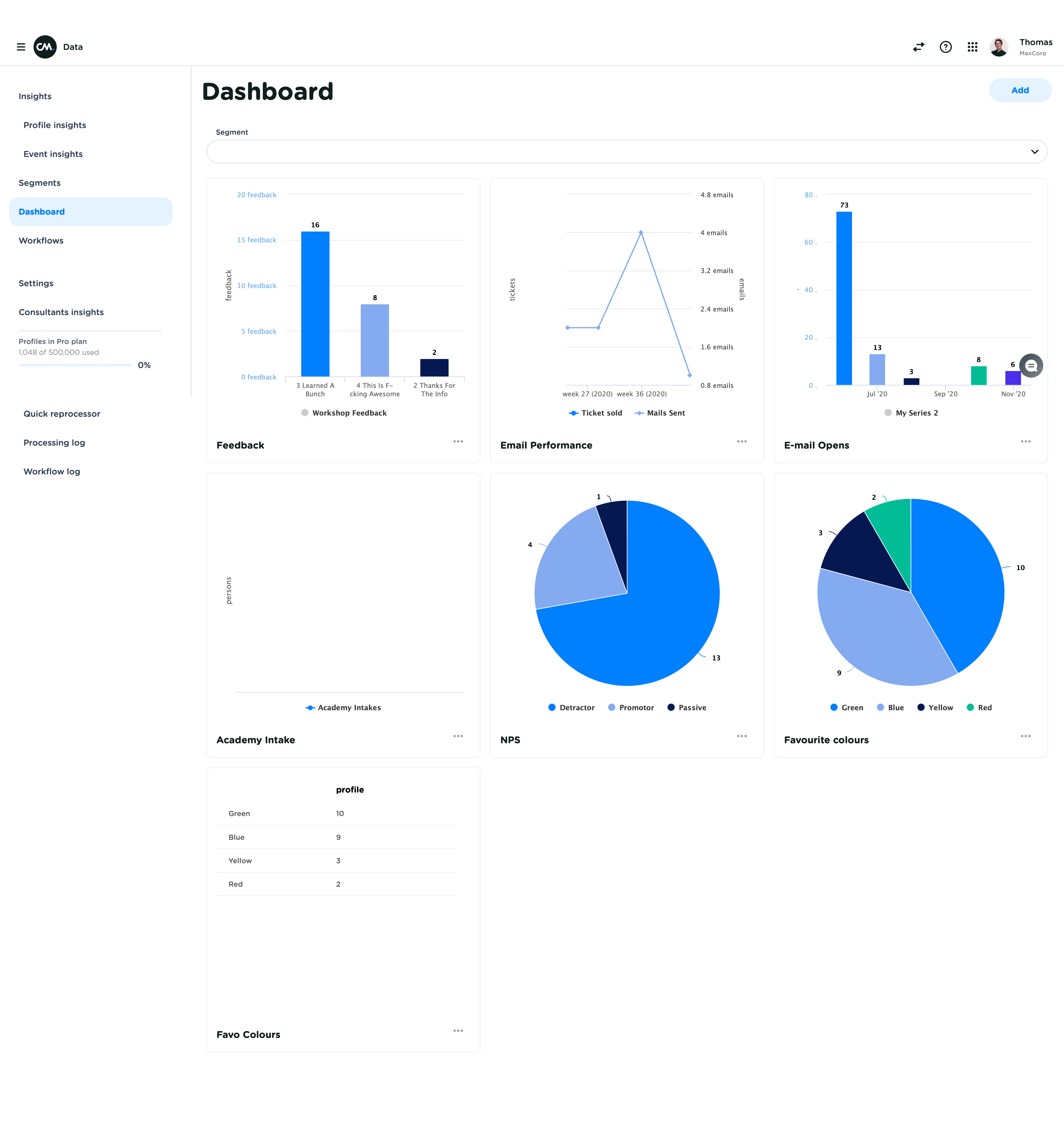
Below you’ll find an impression of the CDP dashboard before the start of the project.

Generative research
Interviewing customers about what tools they use for analytics, and what could make their data more useful and actionable. Generated insights into the user experience of the current analytics dashboard, ideas for new metrics that were considered useful for CDP users, and insights in how people would like to use these metrics.
Design & evaluation
Feasibility of the identified 40 user requirements was evaluated with the feature team, resulting in categorisation and a prioritisation list. In collaboration with the engineers, I designed a mockup screen of potential analytics dashboards, while collecting and categorising the different visualisation needs (chart types, tables, etc.).
To conclude internal discussions, I used CM.com’s own Customer Data Platform to construct mockups for all dashboards with their actual data. A second iteration happened after internal evaluations with CM.com’s own marketing department.
The final evaluation was done with the same users that were interviewed at the start of the project. High-fidelity prototypes were made using the customers’ actual CDP data and evaluated in a feedback sessions with the feature team.
Result
2 months after deployment we saw a steep increase in adoption of the Customer Data Platform analytics.
2×5
Users interviewed
40
User requirements defined
4 month
Project duration from beginning to deployment.
+66.5%
Increase in adoption
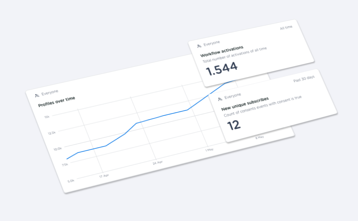
An impression of one of the redesigned analytics dashboards.

Don’t start with an empty page
Originally, users could build their own dashboard and create their own metrics using almost all data in their CDP. This principle is great for advanced users, but very tricky for new users.
That’s why I introduced templating. Each new user started out with pre-filled analytics dashboards with the most relevant metrics for their situation (depending on the applications enabled for their account). Users could then show and hide these metrics to customise their dashboard. The template dashboard helped new users to easy into the complexity of data analytics and increased adoption significantly.
Make it actionable
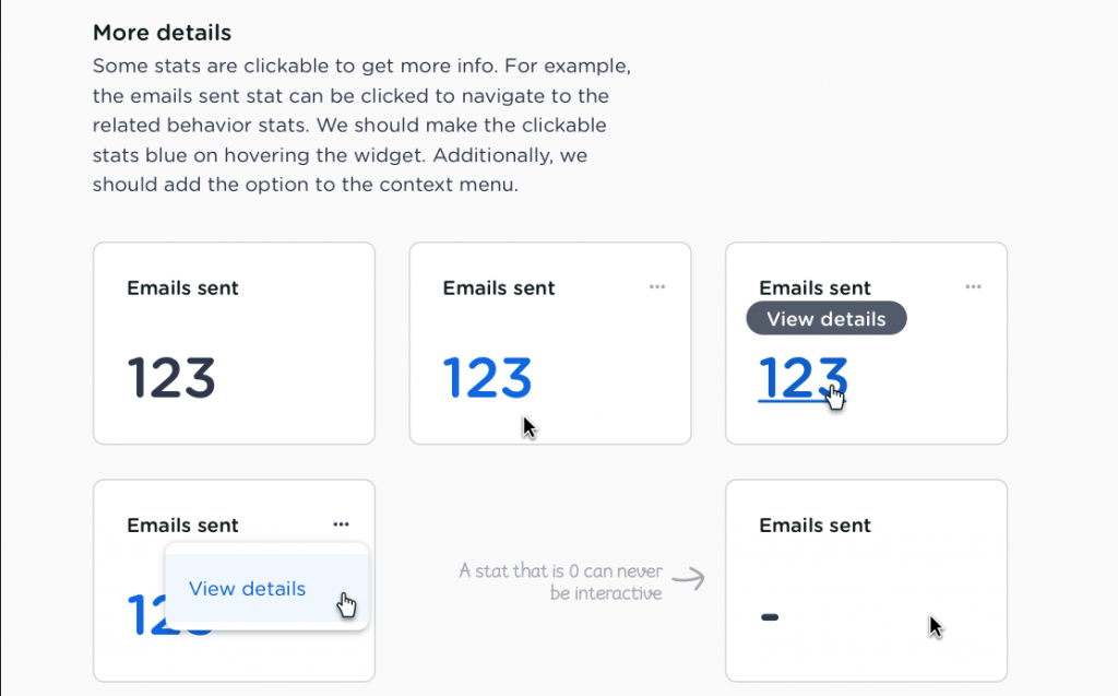
All metrics shown in the dashboards are made actionable. This means that the user could click a card to see all profiles associated with the metric.

Continuous Feedback
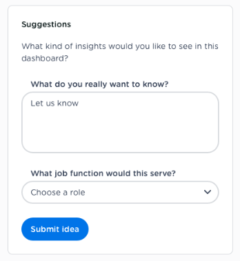
The introduction of the new dashboard created an opportunity for continuous feedback collection from our users. A small form at the bottom of each dashboard allowed visitors to ask for more metrics and additional features.


